
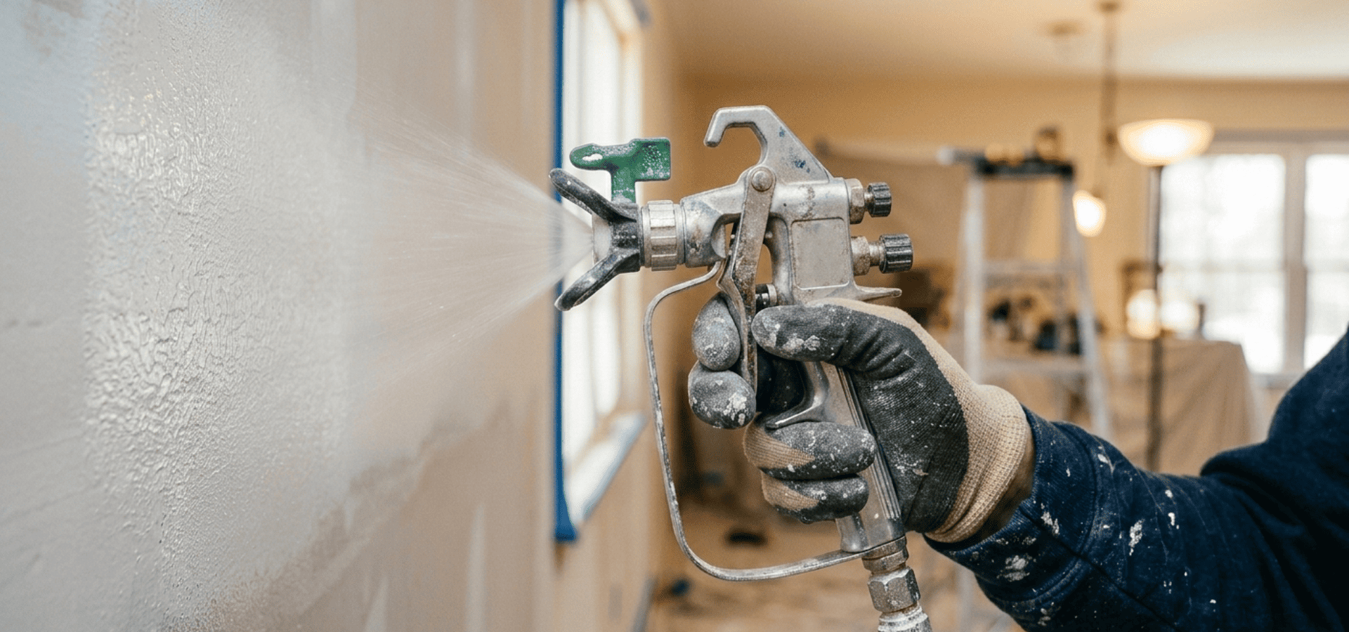
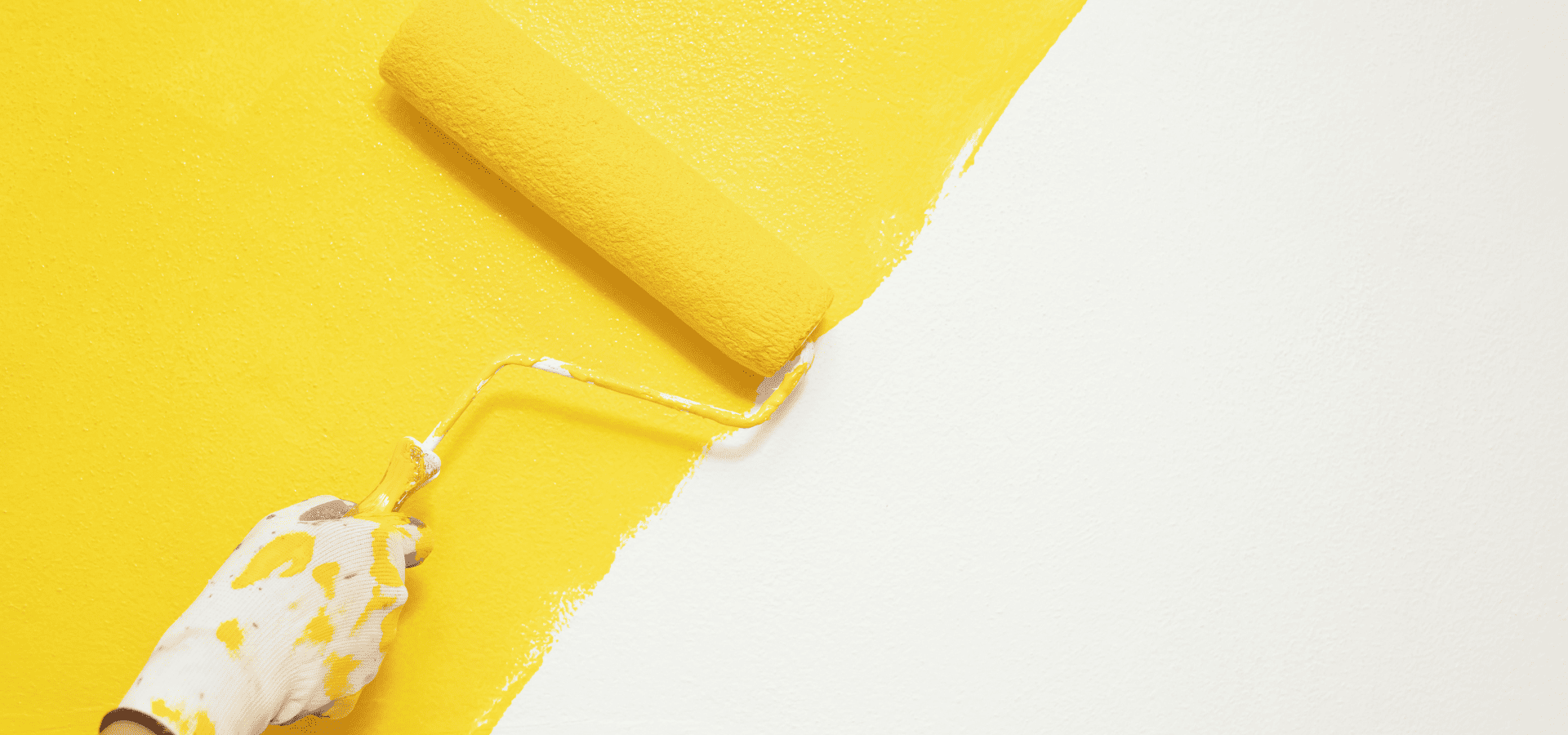
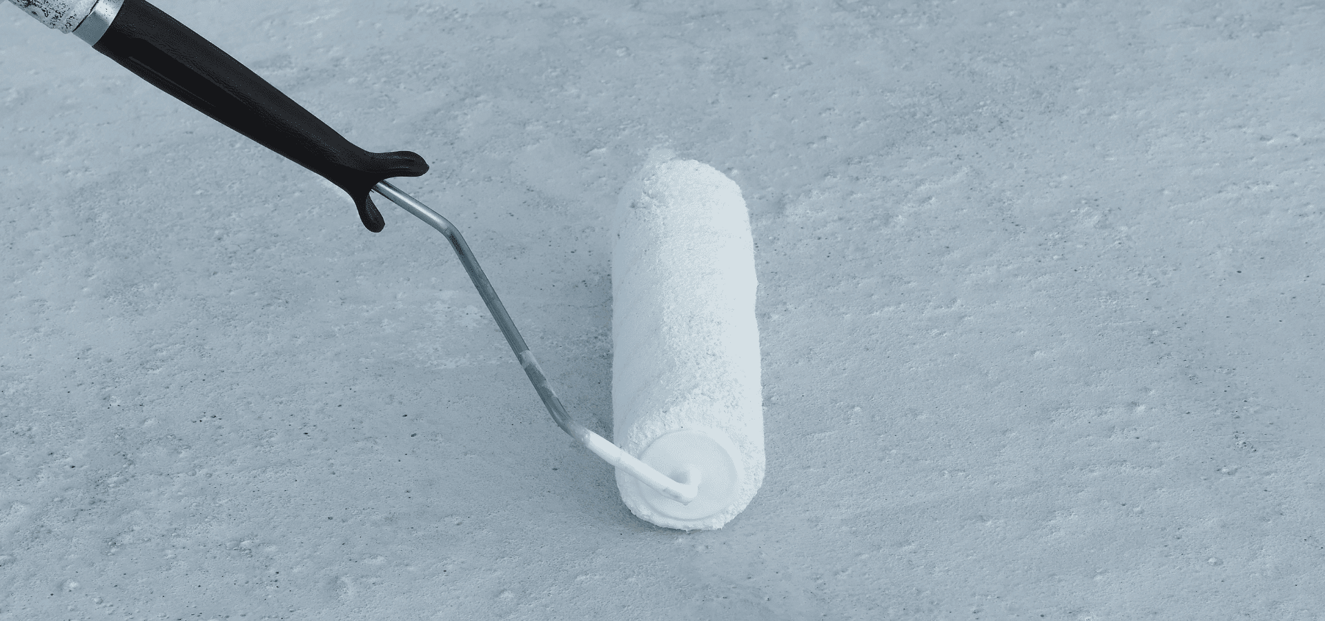
Spray paint generally takes about 30 minutes to 2 hours to dry to the touch — but to fully cure, it usually takes anywhere from 24 to 48 hours, depending on various factors like the type of paint, the thickness of your coating, how well ventilated your space is, and so on. Knowing these factors can help you better estimate drying time, and you can even reduce it by controlling certain variables. Spray Paint Drying Time Factors Some of these factors may be out of your control, but many variables can be controlled to help your paint dry faster and prevent issues like runs, drips, or dust sticking to the painted surface. Paint Type First up is the formula of your spray paint. This is actually the biggest determining factor of your paint’s drying speed. However, it's also not something that you have much control over. You can't simply choose the fastest-drying paint. Instead, the paint type you end up using is largely decided by the surface you're painting, as different surfaces — such as wood and metal — have different paint formulation requirements. That said, knowing the approximate drying time for each type helps you set more accurate expectations: Enamel spray paints: Enamel spray paints typically take 30-60 minutes to dry, but 24-48 hours to cure. Enamel paint is worth the long wait, as the result is a very robust and hard finish. Acrylic spray paints: Acrylic spray paints usually dry within 10-30 minutes, and cure within 24 hours, making them ideal for lightweight indoor projects or craft work. They're less durable than enamel unless sealed, but they’re great for decor and light-use items. Lacquer spray paints: Lacquer is the fastest-drying spray paint type, typically drying within 5-10 minutes and curing within 24 hours. In many cases, they can even reach functional hardness within hours. This makes them ideal for applications that require fast drying, such as furniture and certain automotive finishes. Climate & Temperature Environmental conditions can heavily influence drying time, but that doesn't always mean hotter is better, as excessive heat can cause paint to dry too quickly, leading to cracking or a chalky finish. As such, always aim to paint during mild, stable weather, regardless of whether you're painting indoors or outdoors. It's also worth noting that spray paint performs best around 21–27°C with relative humidity below 65%. Thickness/Number Of Coats
Despite modern advancements that have made latex paints more durable, ultimately, oil-based paints still triumph when you need maximum durability and a smooth, hard finish. This doesn’t mean you should use oil-based paints for everything though, as they release more toxic fumes and are harder to clean up. For projects where added toughness isn’t needed, such as for interior walls, latex paints are the better choice, as they release less odor and dry quicker too. Both types of paint have their place, and it’s important to know when to use each one, so that you get the right level of durability needed for your surface without exposing yourself to unnecessary levels of toxic fumes. Here’s when to use oil-based paints and latex paints. When To Use Oil-Based Paint? Oil-based paints are made with oil as the binder instead of water. This allows oil-based paints to level out more smoothly and cure into a harder, more durable surface that’s able to resist scuffs, scratches, and heavier traffic. However, oil-based paints also dry more slowly, and they come with a major downside — strong odor and fumes. These fumes can potentially be harmful to your health if you inhale too much of them, which is why proper ventilation is crucial when using oil-based paints. Having said that, the toughness that oil-based paints bring is worth these tradeoffs, and oil-based paints are still the best option for high-traffic areas. These include windows and doors , which frequently come into contact with hands from opening and closing. Oil-based paint helps windows and doors stand up to constant handling without scuffing or wearing out quickly. Cabinetry and furniture are also classic use cases for oil-based paint. Cabinets, like windows and doors, get opened and closed frequently, and items are constantly being taken from and added to the shelves, all actions which accelerate wear and tear. Furniture, needless to say, are sat on, moved around, and have items placed on them all the time. That’s why oil-based paints are used for furniture and cabinet painting . Metal surfaces are another common use case for oil-based paints, not because of the added durability, but because oil-based paints are able to bond and adhere to metal better than latex paints can. Oil-based paints also seal the surface tightly and keep moisture out, which helps prevent rusting. When To Use Latex Paint?
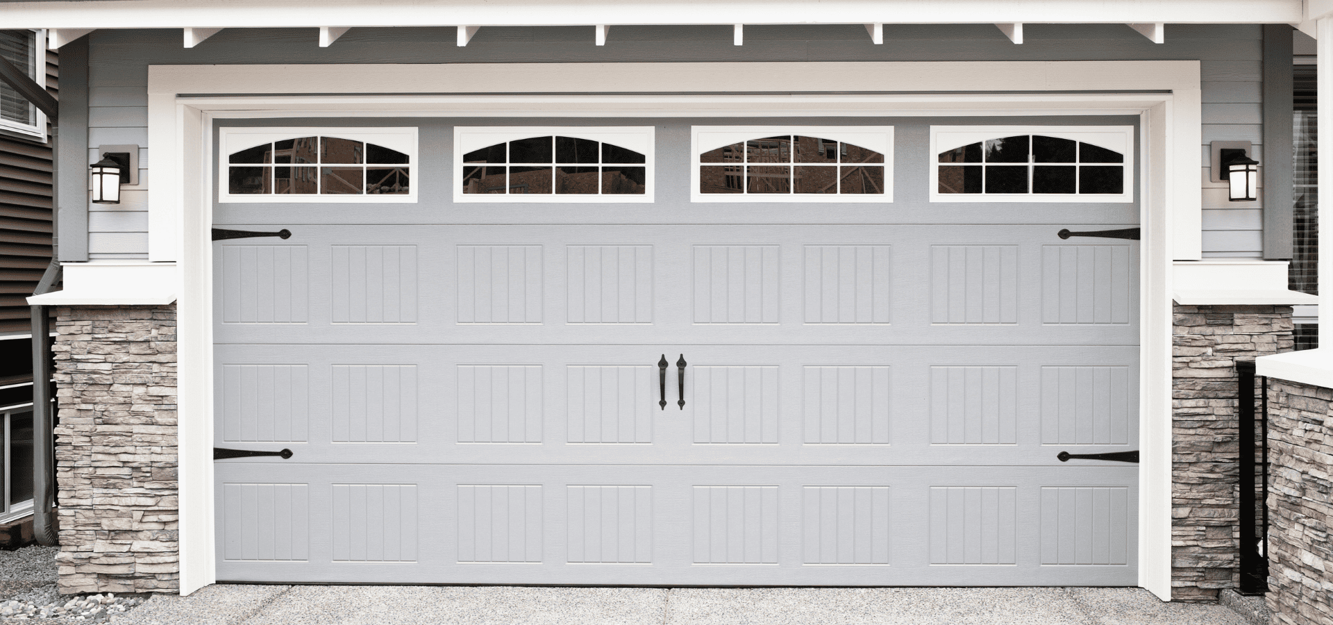
Painting your garage door is a slightly different process from painting your regular walls. Your garage door has panels and grooves that regular walls don't have, and if it's steel, you'll also have to factor in rust and oxidation. Plus, your garage door needs to be able to open and close, so you’ll also need to make sure not to gum the panel seams and the hinges of the door. And then there's choosing the right paint and primer, safety prep, and a few other things to take note of. This might sound slightly scary, but don't worry — it's less complicated than it sounds, and we're here to guide you through the entire process, from start to finish. Let's begin. Tools & Equipment
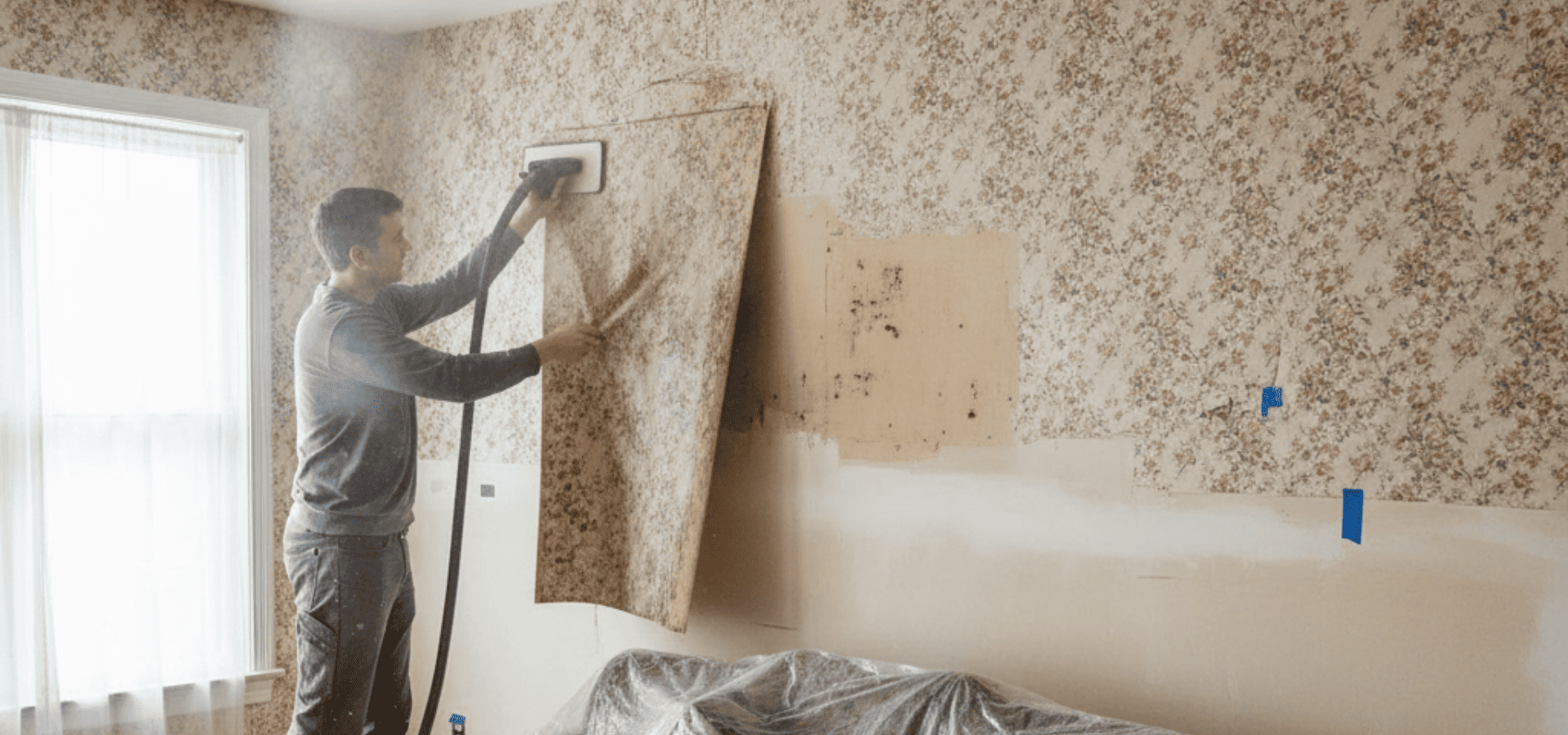
Wallpaper removal can be a costly and tedious process, especially for older wallpaper, not to mention the drywall repair that comes after. That's why many homeowners would rather just paint over it. However, in most cases, it's best to remove the wallpaper before painting. All wallpaper eventually comes off, and when it does, your paint comes off with it too. Only under very select conditions does it make sense to paint over your wallpaper. In this article, we'll be walking you through exactly when you should remove your wallpaper and when you can paint over it. When You Should Remove Wallpaper The fact is, in the majority of cases, you should remove your wallpaper, and the reason for that is simple — unless it's in near-perfect condition, it's either going to peel off soon, or the final product will be unsightly. First off, when you paint over wallpaper, the moisture from the paint can soften the wallpaper adhesive, and the wallpaper could peel off even sooner, taking your paint right off with it. Even putting that aside, wallpaper usually has small bumps or bubbles that become much more obvious when you paint over them, resulting in ugly bumps in your paint job. Furthermore, moisture from the paint and primer can also make these bubbles form underneath, creating even more of these bumps. In a nutshell, painting over wallpaper will usually either result in an unsightly paint job or cause your wallpaper to peel off sooner and take your paint with it. That’s why most of the time, it just Despite this, under very specific conditions, it can actually make sense to paint over the wallpaper. And we say very specific, we mean it. Your wallpaper literally has to be in a near-perfect state. When You Can Paint Over Wallpaper
Yes, even during cold weather or winter, it’s safe to paint inside your home as long as the conditions are right. Even though you’re painting the interior of your home, which should be much warmer than the exterior during cold weather, if it’s too cold or humid, the paint still won’t cure or adhere properly. During cold weather, your windows will also likely be closed, so you also need to make sure there’s enough ventilation. This is essential to ensure that the air doesn’t become too humid, as well as to ensure your safety, because even low-VOC paints can be quite toxic if trapped in an enclosed space. As such, it’s important to take the necessary precautions and ensure the conditions are right before you start painting. As long as you control the temperature and humidity and ensure there’s adequate ventilation, indoor painting is 100 percent safe, even during cold weather or winter. When Is Indoor Temperature Too Cold For Painting? Anything below 50 degrees Fahrenheit is too cold for painting. Below that, the paint may take much longer to dry and cure, and even after drying and curing, may still not adhere properly, leading to peeling later on. It may also develop streaks, blotches, or an uneven finish. While 50 degrees Fahrenheit is the absolute lowest that you should go, ideally, keep it to 60 degrees Fahrenheit and above. This will help your paint dry and cure faster and better. Indoor Painting Tips
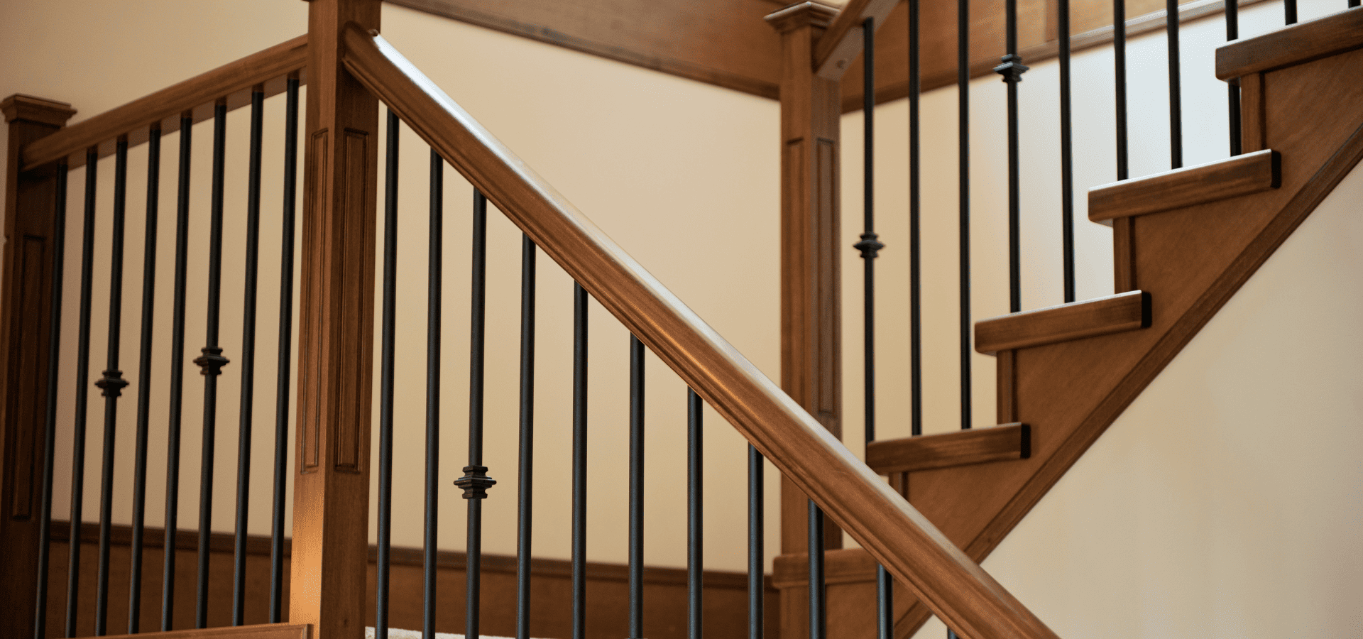
Your stair railings don't take up as much surface area as your walls or even your cabinets, but just like how adding a vase can elevate a dining table's aesthetics, painting your staircase railings can improve the overall look of your home. For example, painting your railings a sleek black can instantly change your home’s vibes from farmhouse to modern and contemporary. Painting stair railings is generally less tiring than painting walls and more straightforward. You do need to be a bit more careful, as you'll have to manoeuvre around various tight spots and corners, but overall, it’s a lot less painting to do, and it’s relatively simple, with fewer things to take note of. Here’s how to go about it. Gather Your Supplies These are the supplies that you’ll be needing: Mild detergent and degreaser Sandpaper (Medium and fine grit) Painter’s tape and drop cloths Wood filler Paintable caulk Angled brush Primer Enamel trim paint in satin or semi-gloss finish Step 1: Carry Out Repairs Whatever you’re painting, you should never be painting over damages. Otherwise, when those damages worsen, they’ll compromise your paint and lead to issues like peeling and bubbling. Here are the various damages and how to fix them: Loose spindles: Secure any wiggling spindles with wood glue at the top and bottom if the gap isn’t too big. If it’s too big of a gap, use wood filler instead, let it dry, and then sand it smooth. Cracks, dents, and holes: Fill them up with wood filler slightly higher than the surface level, as it’ll shrink as it dries. Then, once the filler has dried, sand them smooth. Rust (for metal railings): Scrub the rust off with a wire brush or sandpaper, then continue scrubbing until the surface is smooth, and then apply a rust-inhibiting primer before painting. Step 2: Cleaning And Sanding
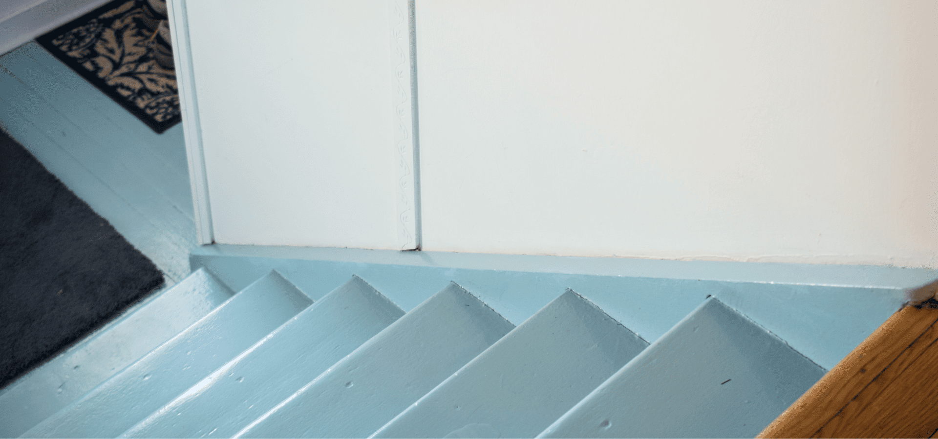
Is your staircase scuffed, worn-out, or just plain outdated? A repaint might just be the answer. Repainting your staircase can make it look good as new without the cost of a full replacement, while at the same time enhancing its durability. You'd also be able to customize it however you like. You could have an elegant, timeless dark brown, a modern monochrome, or a warm neutral staircase — it's entirely up to you. Sure, it might be a bit more tedious than regular wall painting, but you won't have to worry about a thing, because you’ll have this handy guide by your side! We'll be bringing you through the entire painting process, from gathering your supplies to picking the right primer and paint, and of course, painting your stairs the right way. Stairs Painting Tools & Equipment
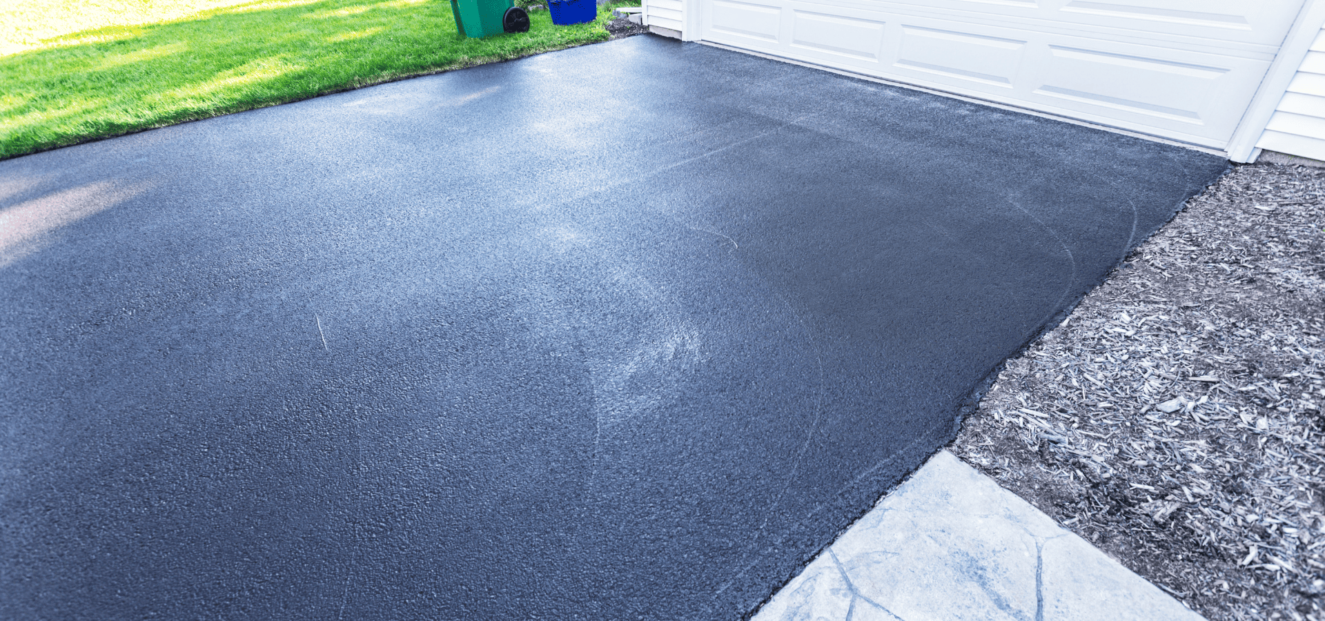
Your driveway is one of the first things that passers-by and visitors see. It's also the first thing that greets you when you return home. Granted, most driveways aren't there for aesthetics, but a worn-out driveway can give your property an overall rundown and neglected feel. To prevent this, you don't have to splurge on an expensive driveway replacement — all it takes is some simple repairs and a new coat of paint (or technically coating). In this article, we're going to cover how to choose the right coating, how to apply it for both concrete and asphalt driveways, and other important things to note when painting a driveway. Here's how to ensure a smooth and successful driveway paint job. How Much Of An Impact Can Painting Make? It's not just about looking nice — a new layer of coating is instrumental to ensuring the longevity and durability of your driveway. UV rays, moisture, and oil are the main culprits behind cracking, fading, and staining. A good protective coating shields your driveway from these damaging elements, adding years to its lifespan and dramatically reducing the amount of maintenance and repairs that you'll need to perform. And don't forget that with the huge facelift that it gives your home, it also brings up its resale value by quite a fair bit. It's not uncommon for a driveway paint job to yield a return on investment of 50% to over 100%, especially if you’re DIYing to keep costs down. On top of all these, consider that by protecting your driveway and helping to stave off any significant damage, the protective coating delays a $5,000-15,000 driveway replacement. So the impact a coating can have, particularly on your finances, is certainly more than enough to justify the time and capital costs. Here’s how to protect your driveway with a coating. Step 1: Choosing The Right Paint For concrete driveways, since they’ll be subjected to stressors like the weight of cars and friction from car tires, you need to use an extra-tough coating. And there’s no tougher paint out there than a combination of an epoxy base coat with a urethane top coat. These are two separate coatings that you’ll have to purchase on their own, but it’s necessary for maximum toughness. Alternatively, you could also opt for acrylic concrete coatings. Those are less durable, but much easier to apply. Layering an epoxy and urethane coating will give you solid protection. You’ll have: Strong UV resistance Excellent moisture resistance to prevent moisture damage Great abrasion resistance to resist wear and tear from tires and foot traffic Chemical resistance for protection against oil, fuel, brake fluid, etc By layering those two coatings, you’ll keep your driveway well-protected against the main damage culprits — UV rays, moisture, and oil. In comparison, acrylic concrete coatings still protect against UV rays and moisture, but they don’t hold up well against friction, chemicals, and oil. Consequently, if you opt for acrylic concrete coatings, expect to have to recoat about twice as often. Moving on to asphalt, asphalt is petroleum-based, and petroleum reacts poorly with most paints. As such, regular paints won’t stay on asphalt. Instead, you’ll need specialized asphalt sealers. These specialized sealers will soak into asphalt and restore its deep black color, as well as help keep out UV rays, moisture, oil, and chemicals, while also improving the asphalt’s flexibility. Step 2: Cleaning And Repairs If there's debris and dirt all over your driveway, your coating won't adhere securely, so cleaning is an essential preparation step. Cleaning
We live in an amazing time where new discoveries are being made every day, and technology can now do things we’d never have imagined possible a decade ago. In today’s world, your paint can do way more than just make your home look pretty. There are now paints and coatings that can clean themselves, heal their own scratches and scuffs, and even regulate temperature! This means lower energy bills, cooler homes, less maintenance, and safer and healthier living spaces. And that’s not all. There are even more amazing and advanced technologies in the works, and we’ll be covering them in this article too. Ready to find out what these smart paint technologies are and what they can do for you? Let’s begin! What Are Smart Paints And Coatings? Before we get into the actual smart paints and coatings, let’s clear up a common area of confusion first — what actually are smart paints and coatings? Well, there’s actually no strict definition or a single quality that makes a paint or coating smart, and the technologies behind each smart paint and coating can vary quite a bit. In general though, paints and coatings need to be able to sense and react to the environment appropriately to be considered “smart”. So when there’s a change in the environment, whether it’s temperature, light, moisture, or even bacteria, a smart coating would sense it and react in a useful way, whether it’s changing its color, releasing a chemical, or some other reaction. However, a paint or coating can’t be considered “smart” just because it has a bit more added functionality. For instance, there are paints and coatings that reflect more sunlight and keep your space cooler, but those wouldn’t be considered smart since they don’t actually sense the environment, and they don’t react . The definition of smart is still slightly vague, but you get the idea — it needs to sense and react to be “smart”. Alright, now that we’ve cleared that up, let’s jump right into the smart paints and coatings. 1. Self-Cleaning Paints
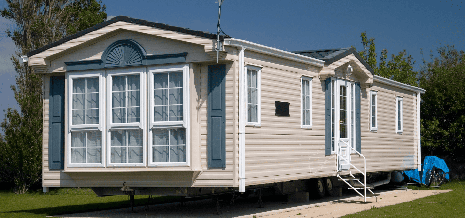
Looking to revamp your mobile home? Or maybe you're just tired of driving around a relic on wheels. Either way, repainting your mobile home can make it look like new again, and turn it from a tired, weathered ride to something that you proudly show off to others. It also helps protect your mobile home’s exterior from the elements, and can even help maintain interior energy efficiency. Before you start painting your mobile home though, you should know that painting mobile homes requires different preparation techniques and steps, as well as different paint types from normal wall painting. The painting application method is the same as for normal walls, but given that you'll be painting either metal siding, vinyl siding, or fiberglass panels, you'll need to prepare them differently for the paint to be able to adhere to them. Since your mobile home will also be exposed to road debris, you'll also need to choose your paint carefully for toughness. And that's not all. There are a few other things that need to be done differently throughout the entire painting process, and it’s important to get them right for a successful mobile home painting project. You’ve got nothing to worry about though, because we’re here to walk you through the entire process. Let’s get started. Tools & Equipment
